Trader dashboard
Working closely with product owners I designed a dashboard for traders using the Citi velocity platform.
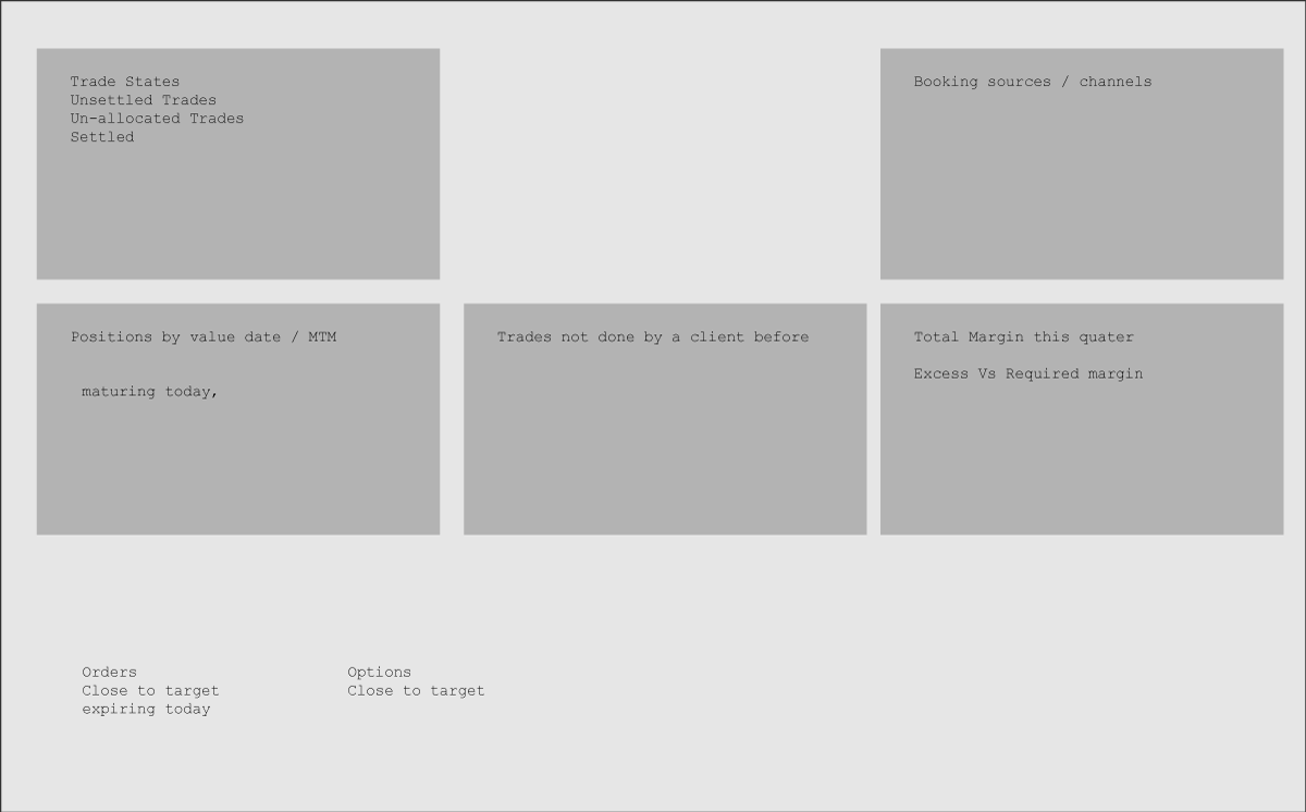
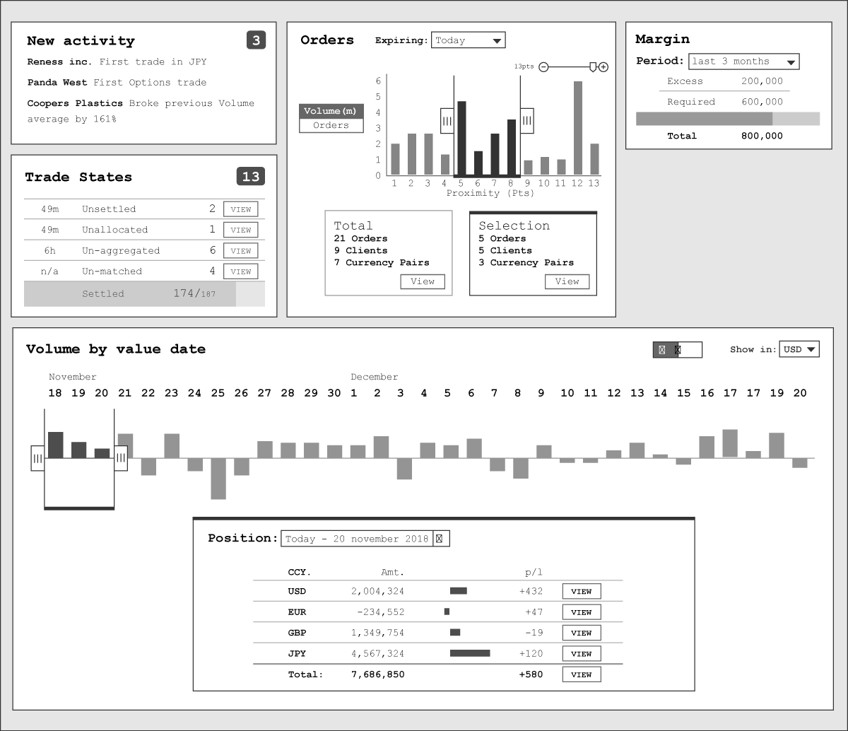
I started with a wireframe to map out the main areas of content and some functionality to use the chart to filter the table below it.


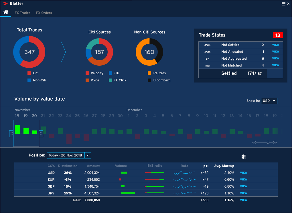
Then added UI polish in the existing style of the rest of the product.

The feedback from traders was interesting. Having done no research or discovery was a mistake and the feedback from the traders unsurprisingly bad. They described it as 'useless' and looks like a 'vanity piece' and in fact they had even become jaded by doughnut charts, as whenever they saw one they felt the screen would have little useful substance.
I didn't want to be caught out by this mistake again so I started a research project to understand the users properly.
Read more