Notifications system
Lots of Velocity's plugins have their own notifications system which differ in quality and format.
The product owners asked me to design what a central notification panel would look like.
I knew that if done wrong the notifications panel would be filled with so much that it would all become noise to the traders which would make it a useless distraction. Above all this system must respect the traders attention and only interrupt them when it's worth it.
With no guidelines or any other UX professionals working on Velocity I wanted to set the standard and give future product owners and developers an idea of what is appropriate content for a push notification.
I started with a content modeling workshop with key technical staff and product owners. Together we mapped out all the likely notifications and what bits of information or content they had.
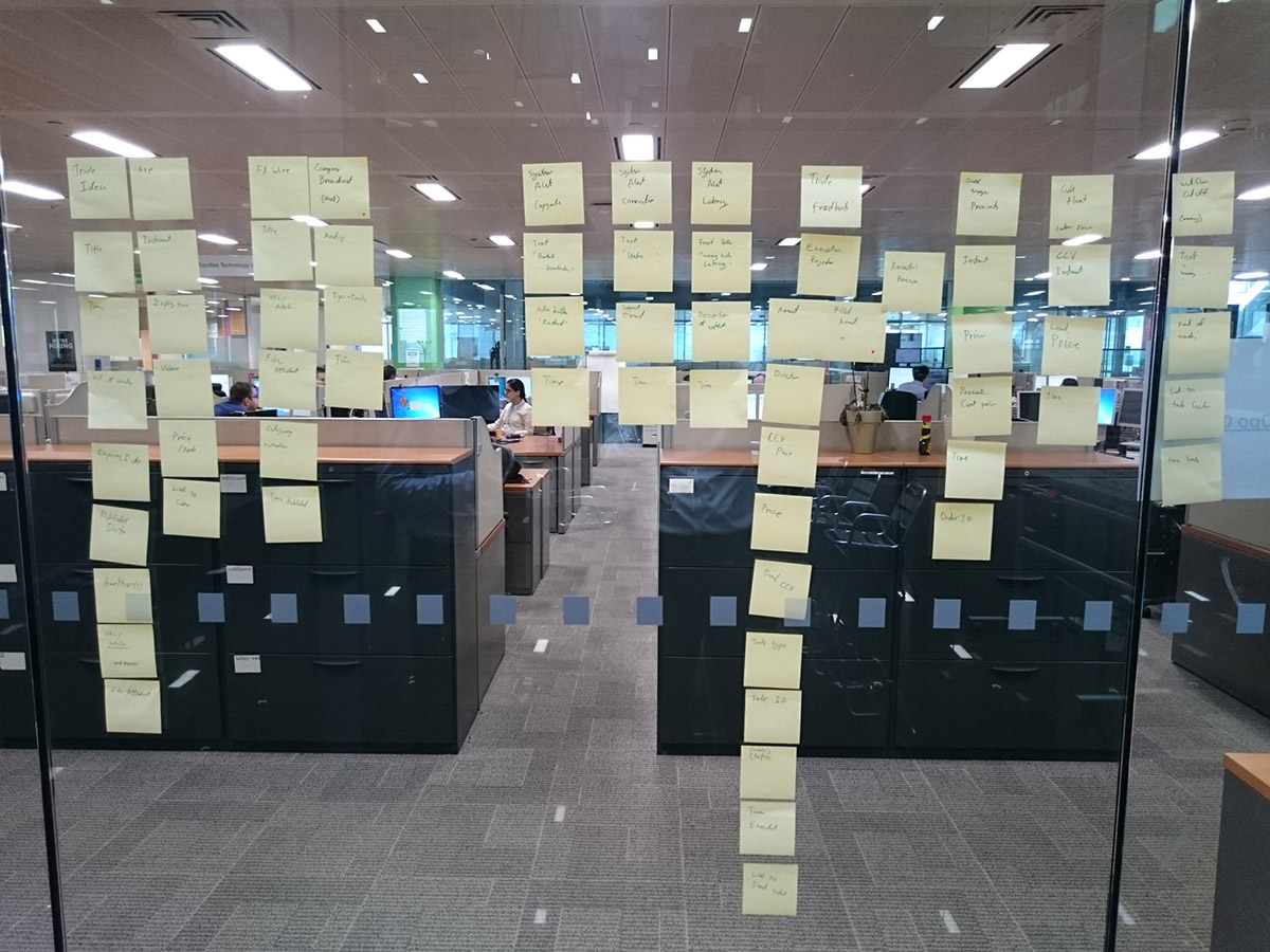
I typed up the output of the workshop and identified the common content types.
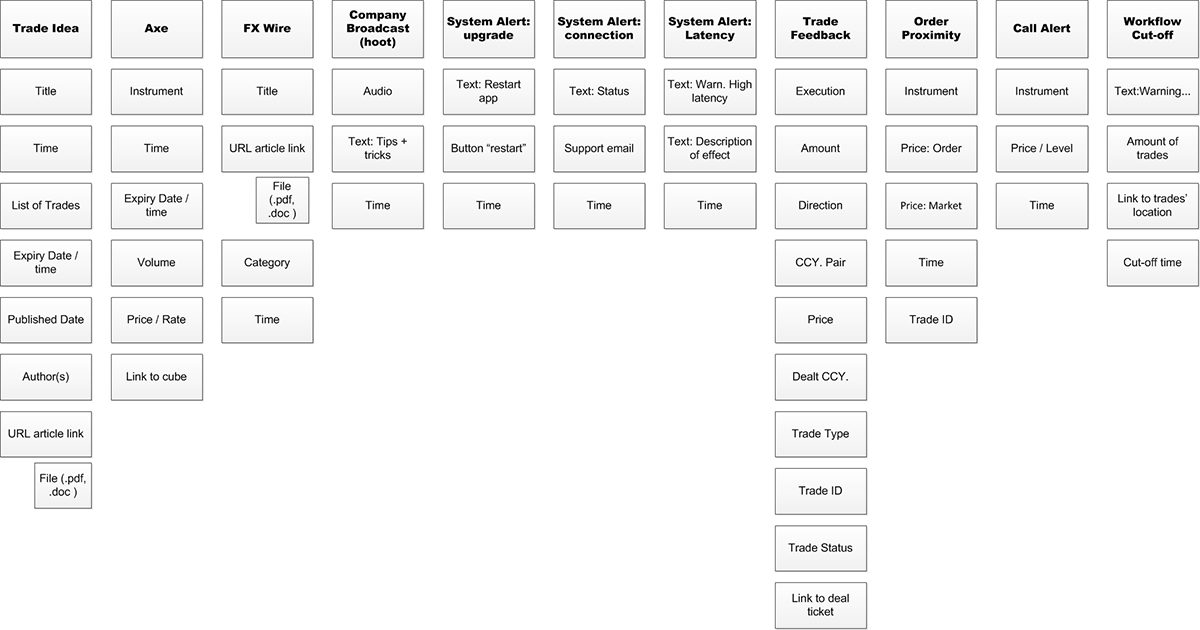
I also spent time deep diving into a particular type of notification that would have multiple appearances as a notification.

Next I used the Eisenhower Matrix to categories the notifications into three groups. Which would effectively inform their hierarchy in the interface.
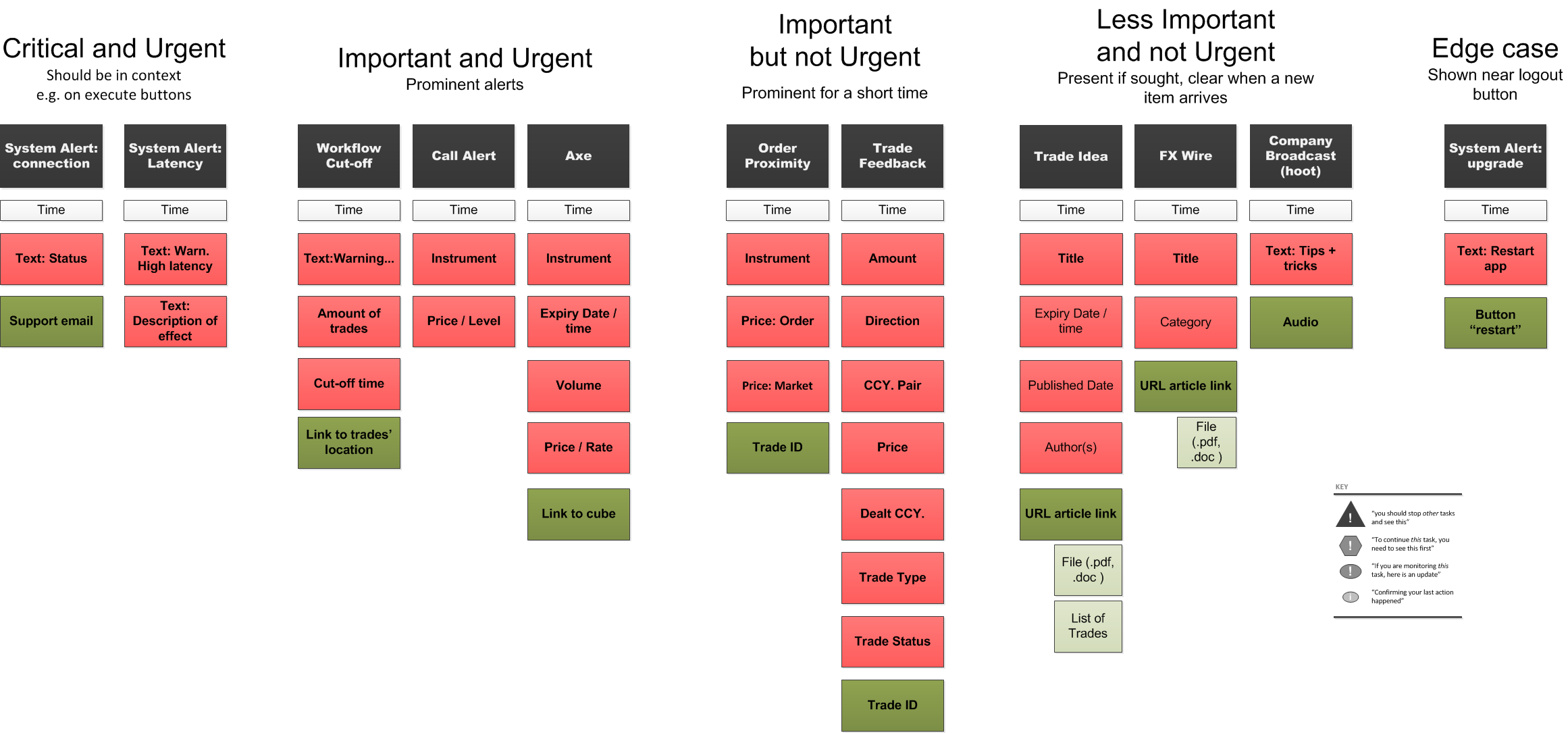
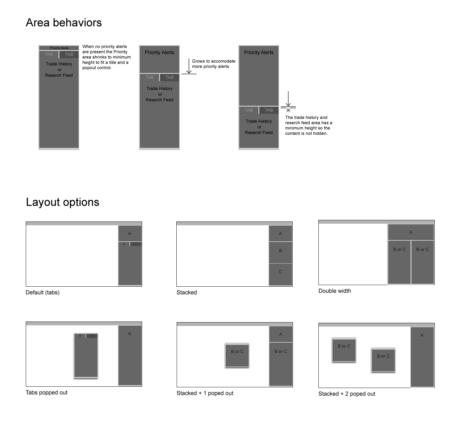
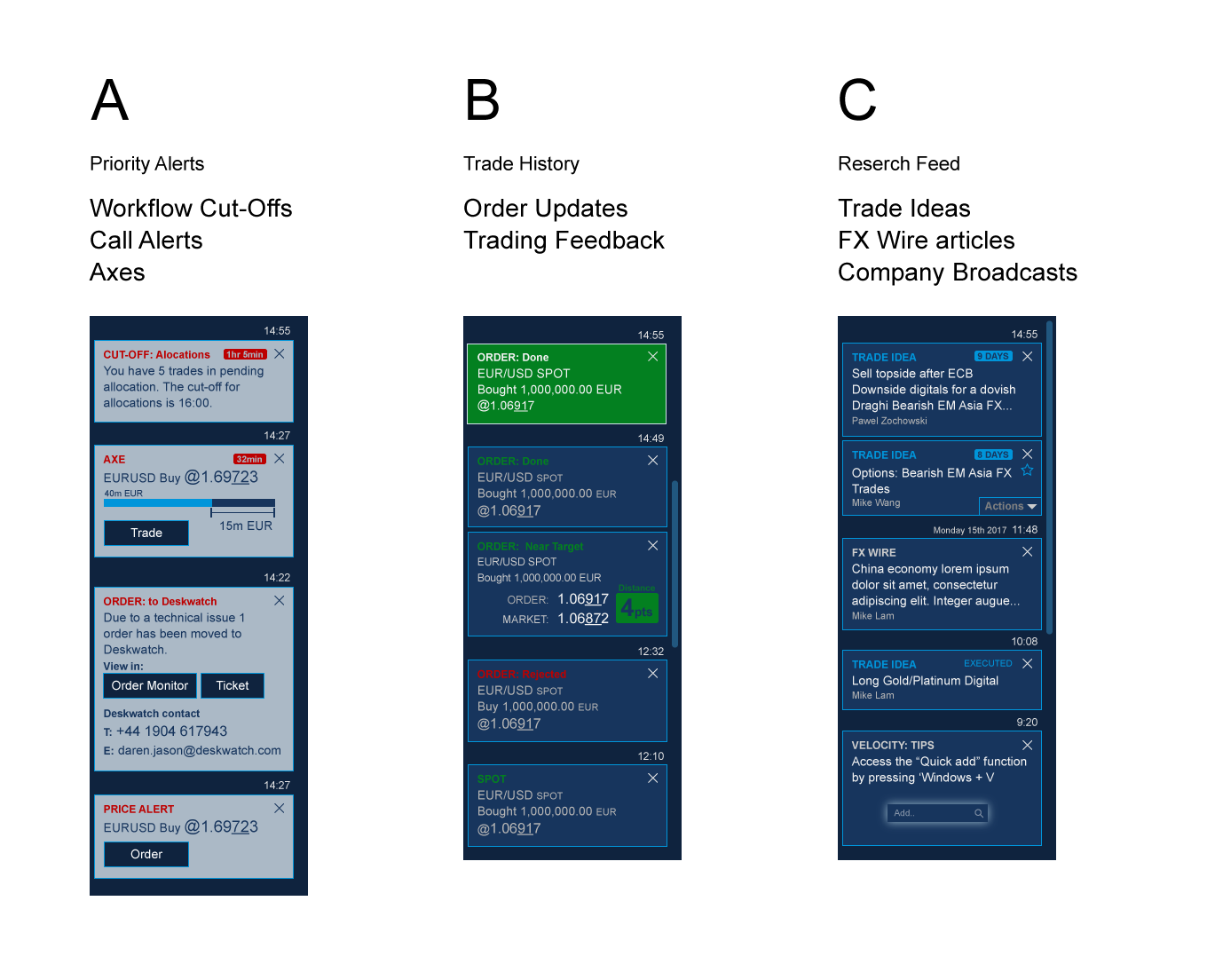
I used this hierarchy to design a notifications panel with three areas with some layout options to cater for different traders needs or screen sizes. The priority area (Urgent and Important) would expand and collapse as required in the compact view. The other two areas where for a trade history (Not-as-important or urgent) and a research/news area (Important but not Urgent). The quadrant missing from the Eisenhower matrix is Urgent and Not important. In this context this is the noise I referred to earlier, so by putting the notifications in appropriate places this group is eliminated.
My next role took me away from trading platforms into the world of asset management at Fidelity International.
Read more